|
When first approaching this project, I experimented with some templates from W3 Schools. I found a resume template that might have served useful to me, but wasn't sure what additional pages I could add. Other templates included some interesting elements, but were so complicated that I could not understand which elements were controlled by which parts of the code. I wanted this project to allow me to use code meaningfully and creatively. For this reason, I decided to start almost from scratch, modifying the initial tutorial from our day of in-class practice. The sketch I had made on paper gave me initial direction, although I decided to keep the alignment more simple than I had originally planned given how difficult it is to align elements in code. I spent around an hour of time resizing and centering the three photos on the "Travel" page, using examples from the W3 Schools website as my guide. While the effort was time consuming, it was extremely satisfying to ultimately see my photos aligned neatly on the page. Another strategy I employed was spending around two hours working with my classmate Hallie outside of class. Doing so allowed us to compare ideas and troubleshoot with the creativity of two instead of one. Ideally, I imaged my site to include a menu along the side of the page, small images framing some of the headings, and photos centered on the page in columns like I had observed on photography blogs. I ended up foregoing these ideas as I realized the complexity of achieving these goals that had seemed simple. Instead of using a menu on the side of the page, I placed a menu along the top. This menu was not a simple endeavor, requiring a closer look at how I incorporated each internal link. I took the time to resize photographs logically so they maintained high quality and the pages appeared balanced. So, while my site might not look like a professional photography portfolio, the images are still styled and placed logically. A variety of modes make up my text. The linguistic mode is prominently featured in the headings and paragraphs that accompany my photos. I carefully selected the words that I feel describe my favorite hobbies, keeping the amount of text intentionally brief. 
0 Comments
 When thoughtfully designed, digital archives rival their tangible counterparts in regards to aesthetics, which, in turn, lead to ease of navigation. I browsed The Cleveland Press Shakespeare Photograph archive, taking note of which design elements were successful and which could use improvement. All in all, the archive was one of the most well-designed of the archives I’ve browsed, many of which scream "The Year 2000 called and it wants its website back!”
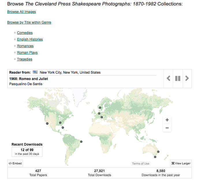
This archive's use of color is well-balanced and not overwhelming. There is plenty of white space to allow the eye places to rest on the screen and to give the site a professional appearance, which most websites designed by universities seem to lack. The color green is used to emphasize the website's highlights, with different shades employed to avoid monotony but keep the pages composed. In adding to Belmont's Shakespeare Performance Archive, we should employ a color scheme that flows well within the pages and between those pages and the home page. Although green and white are not related on the color wheel, paring them together does create contrast between the absence of color in the background and a pop of color in the foreground. I do wonder if the designers had added splashes of green’s complementary color, red, if even more successful layers of contrast would have been created. Organization, proximity, and alignment are also well-executed. The page is organized so that as the viewer looks down the page, the page naturally provides the information in the order that it would be wondered about, starting with an introduction, then providing options for browsing, and finally featuring a dynamic map showcasing the locations of performances whose photographs are contained in the archive. In this way, the website's organization tells the viewers what is interesting rather than forcing them to search for it themselves. Headings and other texts are spaced at uniform proximities, and with the text aligned neatly down the page. The positioning of the menu at the left side of the page makes it more visually interesting and prevents the page from appearing empty. The search bar is positioned at the top of the menu, anticipating the needs of the audience, who are likely to be engaging in research. As we modify the Belmont Shakespeare Performance archive, we should consider the needs of the audience and position useful elements accordingly. Any page, however, is not without room for improvement. The title "The Cleveland Press Shakespeare Photographs: 1870-1982” might stand out more if it had been positioned in the middle of the page rather than being right-aligned. This right-alignment is awkward for those who are accustomed to reading from left to right. Additionally, the highly composed formatting lacks emphasis of particular elements because the headings, texts, and images are so uniform. However, because the audience of this site is interested in ease of navigation and understanding information, uniformity of textual form is preferred over design elements that distract from the site’s information. Cleveland Press Shakespeare Photographs: engagedscholarship.csuohio.edu/shakespeare/ |
Aubrey KellerAubrey is currently attending Belmont University in Nashville, Tennessee. She is studying English Literature and Mandarin Chinese. She is compiling this blog for her Digital Literacies course. Archives
October 2018
Categories |
||
 RSS Feed
